
Customer Portal
Customize colors, sections, and content blocks in your customer portal with a live visual editor
Design a customer portal that matches your brand. Customize colors, spacing, and the layout of content blocks with a live visual editor.
New: Custom Blocks
The Sections tab now supports custom blocks — drop in headings, text, buttons, banners, custom HTML, or Raw Liquid anywhere on the membership page. See Sections and Custom Blocks.
What You'll Get
Brand Colors
Match your store's color scheme exactly
Custom Sections
Rearrange the layout and toggle sections on or off
Custom Blocks
Drop in headings, text, banners, buttons, and custom HTML
Custom Styling
Adjust border radius, card appearance, and spacing
Live Preview
See changes instantly before publishing
Quick Setup
Open the Theme Editor and Preview as a Customer
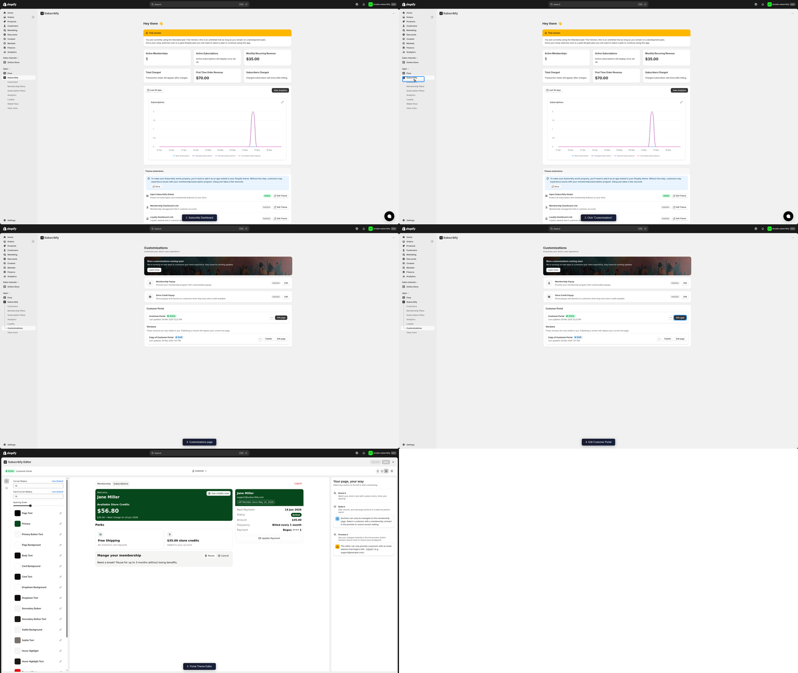
Go to Subscribfy → Customizations → Customer Portal → Edit page. The visual editor opens with a live preview — use the customer selector dropdown to preview how the portal looks with real customer data.
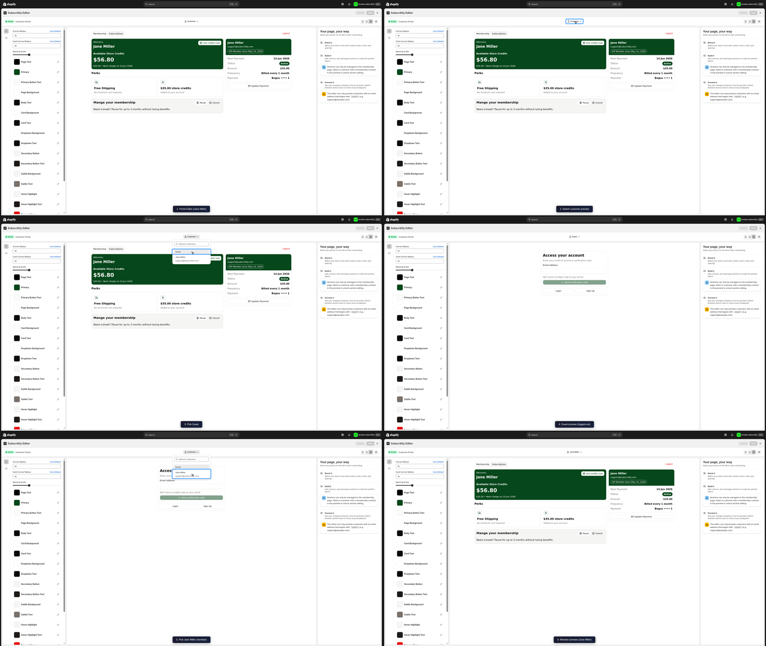
Select a customer with an active membership to unlock section editing. The preview supports Desktop, Tablet, and Mobile breakpoints.
Switch Between Branding and Sections
The left sidebar has two tabs:
| Tab | Purpose |
|---|---|
| Branding | Adjust colors, radius, and spacing |
| Sections | Add, reorder, hide, and configure content blocks |
Changes appear instantly in the preview.
Save or Publish
- Save - Keep changes as draft
- Publish - Make changes live for all customers
- Discard - Revert to the last saved state
Sections and Custom Blocks
The Sections tab lets you build the membership page from a set of blocks. Each block has its own settings, can be hidden without being deleted, and can be reordered with drag-and-drop.
Section editing requires a customer with an active membership in the preview. Without one, the sidebar will only show branding controls.
Page Structure
The membership page is organized into a main column and a sidebar column. Blocks are nested inside these columns.
| Container | Where it appears | Holds |
|---|---|---|
| Main Content | Left/main area of the page | Welcome, Active Offer, Perks, Store Credits History, Management, Custom HTML |
| Sidebar Content | Right column on desktop | Details, Featured Products, Custom HTML |
The portal has tabs at the top of the page. Today the Membership tab is the only editable tab — the Subscriptions tab is shown as Coming Soon and is not configurable.
Section Blocks
These are the high-level sections you can add to the main column or sidebar.
| Block | Description |
|---|---|
| Welcome | Header, content, and footer with greeting, customer balance, and next charge date |
| Active Offer | Shows the subscription's current active offer |
| Perks | Lists active perks granted by the selling plan |
| Store Credits History | History of store credit earned and spent |
| Management | Cancel, pause, resume, and other management actions |
| Featured Products | Product suggestions pulled from a collection (or auto-chosen) — see settings below |
| Custom HTML | Drop in your own HTML for advanced customization |
| Raw Liquid | Render Shopify Liquid snippets inline |
Welcome Section Blocks
The Welcome section is broken into three slots, each with its own allowed children.
| Slot | Allowed Children |
|---|---|
| Header | Heading, Text, Welcome Heading, Custom HTML, Raw Liquid |
| Content | Customer Balance, Custom HTML, Raw Liquid |
| Footer | Next Charge, Custom HTML, Raw Liquid |
| Block | Description |
|---|---|
| Welcome Heading | Greet the customer with a catchy heading |
| Customer Balance | Available customer balance — only renders if the membership has the store credits perk |
| Next Charge | Next charge date — only renders for non-cancelled memberships |
Featured Products block
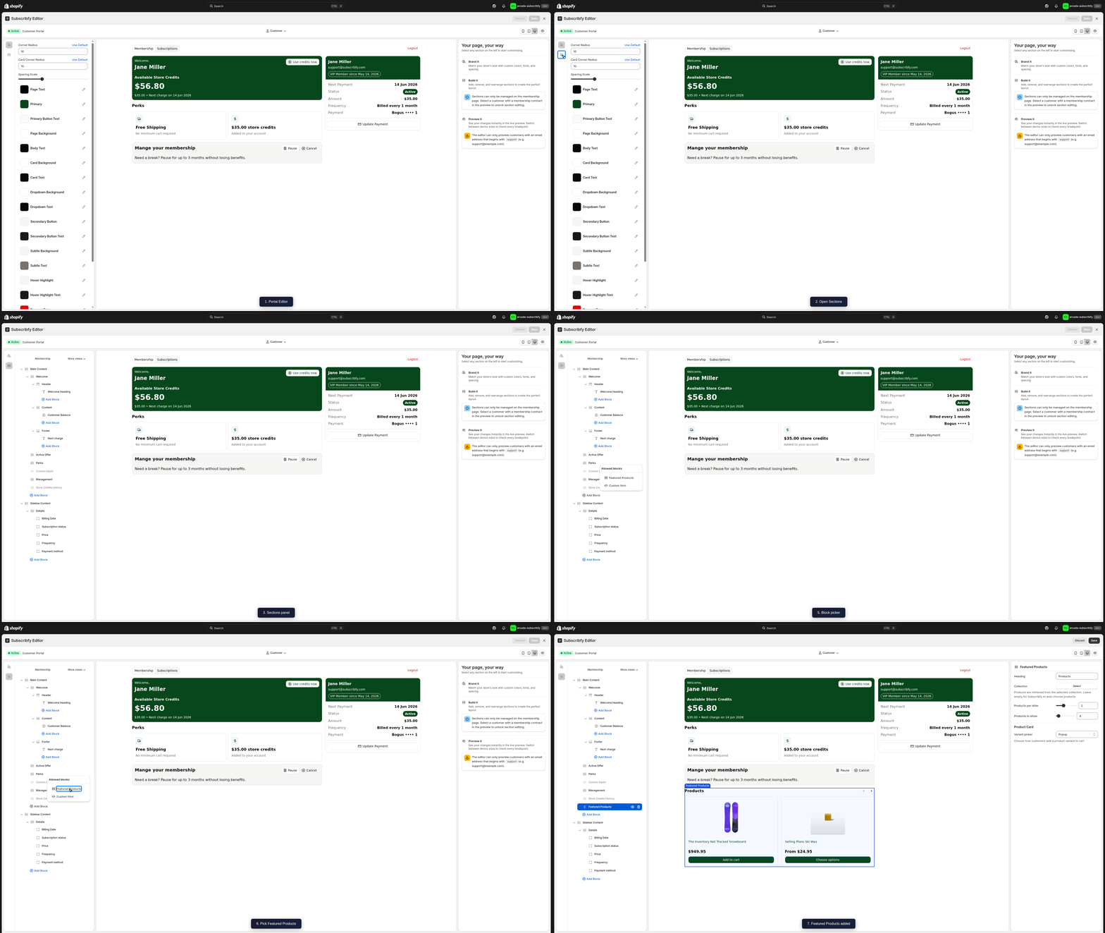
The Featured Products block surfaces a product strip inside the portal — useful for cross-sells, replenishment picks, or simply guiding customers back into the catalog. It can be added to either the Main Content or the Sidebar Content column.
| Setting | Default | Description |
|---|---|---|
| Heading | Products | Title shown above the product strip |
| Collection | empty | Source collection for the products. Leave empty to let Subscribfy auto-choose products for the customer |
| Products per slide | 2 | How many product cards show at once in the carousel (1–4) |
| Products to show | 4 | Total number of products pulled into the strip (1–50) |
| Variant picker | Popup | How customers pick a variant before adding to cart — None (no picker), Popup (modal), or Select (inline dropdown) |
Leave Collection empty for an auto-curated mix based on the customer. Set it to a specific collection (e.g. a "Member Favorites" collection) to lock the strip to that set of products.
Custom Blocks
These reusable blocks can be added to any container that allows them.
| Block | Settings | Use For |
|---|---|---|
| Heading | Text + size (Small / Medium / Large) | Section titles, callouts |
| Text | Multi-line description | Paragraphs and explanatory copy |
| Button | — | Call-to-action links |
| Custom HTML | HTML / app snippet code | Embedding apps or advanced markup |
| Raw Liquid | Liquid template code | Dynamic content from Shopify |
Every block can be hidden (toggled off) or removed using the icons next to its name in the Sections list. Reorder blocks by dragging them within their parent.
Custom HTML Examples
The Custom HTML block accepts any markup and renders it as-is. Use it for static content, embedded widgets, or app snippets.
<div style="padding:16px;border-radius:12px;background:#FFF7E6;border:1px solid #F0D58C">
  <strong>Refer a friend, earn $10</strong>
  <p style="margin:4px 0 0">Share your unique link from the rewards page.</p>
  <a href="/account/rewards" style="color:#B7791F;font-weight:600">Open rewards →</a>
</div>
<!-- Embed a third-party widget by its loader script -->
<div id="my-app-widget"></div>
<script src="https://cdn.example.com/widget.js" defer></script><p style="text-align:center;font-size:14px;color:#666">
Need help? <a href="mailto:support@yourshop.com">Email us</a>
or <a href="https://yourshop.com/pages/faq">read the FAQ</a>.
</p>Raw Liquid Examples
The Raw Liquid block is rendered through Shopify, so it has access to the standard Liquid objects on the storefront (customer, shop, cart, etc.). It cannot be previewed inside the editor — visit the live portal to see it rendered.
Liquid content is processed by Shopify, not Subscribfy. Only objects available on the storefront page are exposed. Do not put secrets or admin-only data in this block.
{% if customer %}
  <h2 style="margin:0 0 8px">Hi {{ customer.first_name }} 👋</h2>
  <p>Thanks for being a member since {{ customer.created_at | date: "%B %Y" }}.</p>
{% endif %}
{% assign last_order = customer.orders | first %}
{% if last_order %}
<p>
Your last order
<a href="{{ last_order.customer_url }}">#{{ last_order.order_number }}</a>
is currently <strong>{{ last_order.fulfillment_status | default: 'processing' }}</strong>.
</p>
{% endif %}{% comment %}
Subscribfy writes a JSON object to `exison.customer_subscription1`
(and `customer_subscription2`) with name, status, member_since,
next_billing, price, currency. Use it to render member-only content.
{% endcomment %}
{% assign sub = customer.metafields.exison.customer_subscription1 %}
{% if sub.status == 'ACTIVE' %}
<div>
<strong>{{ sub.name }}</strong> · member since {{ sub.member_since }}.<br/>
Next charge {{ sub.next_billing }}.
</div>
{% endif %}What can it confirm? Common patterns: confirming the customer is logged in ({% if customer %}), checking tags ({% if customer.tags contains 'vip' %}), reading order history, or rendering content only on certain dates ({% if 'now' | date: '%m' == '12' %}). For member-aware content, Subscribfy exposes customer.metafields.exison.customer_subscription1 (and customer_subscription2) with status, name, member_since, next_billing, price, and currency.
Recharge Rewards Card (Membership Punch Card)
If you run a Membership Punch Card with free-product rewards, Subscribfy ships a card that lists each member's earned free-gift rewards directly inside the portal. Add it as a Raw Liquid block on the membership page.
This card only renders for stores with at least one active Membership Recharge Punch Card rule that grants free-product coupons. If you don't run that rule type, skip this section.
Download the asset
Right-click → Save link as… to download the script:
Download subscribfy-recharge-portal.js
You can also view the source inline (see View the script source below) and copy-paste it into your theme.
Upload the asset to your theme
In Shopify admin go to Online Store → Themes → … → Edit code. Under the Assets folder, click Add a new asset, then select Create a blank file and name it:
subscribfy-recharge-portal.jsPaste the downloaded file's contents and Save. The final path is:
assets/subscribfy-recharge-portal.jsAdd the Raw Liquid block
In the Portal Theme Editor, open the Sections tab and add a Raw Liquid block where the rewards card should appear (typically inside Main Content).
Paste this snippet into the block's content field:
<div class="exm_membership_status_block subscription_type_1" style="display: none;"></div>
<img src="x" style="display:none" onerror="var s=document.createElement('script');s.src='{{ 'subscribfy-recharge-portal.js' | asset_url }}';s.defer=true;document.head.appendChild(s);this.remove()">
Save and verify
Publish the page, then open the customer portal as a member who has earned a free-gift reward. The rewards card appears directly under the host <div>.
Editing a Block
Select the Block
Click any block in the Sections list. The right sidebar opens with that block's settings.
Adjust Settings
Edit text, choose a size, paste HTML, or pick options. Each block exposes only the fields that apply to it.
Add Child Blocks
For containers (Main Content, Sidebar Content, Welcome, Details), click Add Block to insert one of the allowed children.
Reorder or Hide
Drag a block within its parent to reorder it. Use the visibility icon to hide it without deleting.
Color Variables
The portal uses the OKLCH color space for accurate, consistent colors across devices.
| Variable | Description | Default |
|---|---|---|
| Primary | Main action color (buttons, links) | Dark brown |
| Primary Foreground | Text on primary buttons | Light cream |
| Secondary | Secondary buttons and accents | Light gray |
| Secondary Foreground | Text on secondary elements | Dark |
| Accent | Highlight and hover states | Light gray |
| Accent Foreground | Text on accent elements | Dark |
| Destructive | Cancel/delete buttons | Red |
| Variable | Description | Default |
|---|---|---|
| Background | Main page background | White |
| Card | Content card backgrounds | White |
| Card Foreground | Text inside cards | Dark |
| Popover | Dropdown/modal backgrounds | White |
| Popover Foreground | Text in popovers | Dark |
| Muted | Subtle backgrounds | Light gray |
| Variable | Description | Default |
|---|---|---|
| Foreground | Main text color | Dark brown |
| Muted Foreground | Secondary/help text | Medium gray |
| Primary Text | Heading text | Black |
Layout Variables
| Variable | Description | Range |
|---|---|---|
| Radius | Global border radius | 0-20px |
| Card Radius | Corner radius for cards | 0-20px |
| Spacing | Multiplier for gaps | 0.5-2x |
Start with radius 10px and spacing 1x. Adjust based on your brand style.
Version Control
The editor supports multiple versions of your portal design.
| Status | Meaning |
|---|---|
| Active | Currently live for customers |
| Draft | Saved but not visible to customers |
Working with Versions
Responsive Preview
Test how your portal looks on different devices using the toolbar icons.
| Icon | Device | Width |
|---|---|---|
| Mobile | Phone | 375px |
| Tablet | iPad | 768px |
| Desktop | Computer | 1200px |
Best Practices
Troubleshooting
Related Features
Customer Portal Settings
Set up customer actions and login options
Custom CSS
Add advanced styling with CSS code
Was this page helpful?